Case Study — Power BI Healthcare Dashboard
Transforming Emergency Department Visibility and Decision-Making
Client Challenge
A major A&E lacked timely and reliable visibility into patient arrivals, flow, and time spent within the department. Key operational metrics — including arrivals by hour, patient acuity, admission rates, discharge outcomes, and waiting times — were reported through manual processes and static reports that were often out of date by the time they reached decision-makers. Data was fragmented across systems, making it difficult to understand how demand varied throughout the day and where clinical or operational bottlenecks were occurring.
As patient volumes increased and waiting time targets came under greater scrutiny, both clinical and operational leaders needed a clearer, real-time view of department performance. Without a consolidated picture of patient flow, it was challenging to proactively manage staffing levels, identify pressure points in the care pathway, and intervene early to reduce prolonged waits and improve patient safety. Leadership required an interactive, data-driven solution that could support day-to-day operational decisions as well as longer-term capacity planning.
Solution
We worked closely with clinical, operational, and performance teams to understand how the Emergency Department was functioning on a day-to-day basis and which metrics were critical for patient safety and operational control. We focused on understanding patient flow from arrival to outcome, identifying where delays were occurring, and ensuring that the dashboard aligned with NHS performance standards and internal reporting needs.
To support these operational goals, we designed a data structure that ensures performance and consistency. To enable real-time analytics, the solution connects directly to a SQL Server data source using DirectQuery, ensuring insights reflect the most current operational data. The underlying data model was designed using a star schema, with fact tables capturing patient journeys and performance metrics, and dimension tables for date, patient demographics, presenting complaints, and diagnoses. Performance and scalability were addressed through SQL views for pre-aggregated data, structured hierarchies for time-based analysis, and DAX measures to calculate critical KPIs such as five-hour and twelve-hour waits. This robust data foundation ensures the dashboard supports both real-time operational decision-making and longer-term service improvement analysis.
A three-page Power BI dashboard was then designed to provide a complete, interactive view of the Emergency Department patient journey. The Overview page delivers rapid situational awareness for leadership, presenting headline activity metrics alongside trends in arrivals by age group and time of day. It also highlights the most common presenting complaints and diagnoses, enabling leaders to quickly understand demand patterns and emerging pressures.
The Patient Flow and Clinical Pathways page provides a deeper operational and clinical view of activity within the department. It shows arrivals and admissions by day and age group, as well as hourly patient load using ribbon visualisations to reveal how demand shifts throughout the day. Sankey diagrams illustrate how patients move from presenting complaint and diagnosis through to discharge outcomes, helping clinical teams understand pathways, admission pressures, and outcome distribution. Top presenting complaints and diagnoses are surfaced to support clinical governance, rostering decisions, and demand planning.
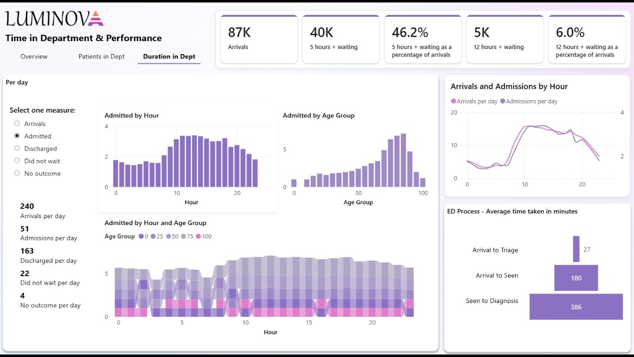
The Waiting Performance and Time in Department page focuses on patient experience and safety. It tracks key performance indicators such as the number and percentage of patients waiting more than five and twelve hours, alongside interactive analysis of arrivals, admissions, discharges, and patients who did not wait. Hourly comparisons of arrivals versus admissions highlight capacity constraints, while a patient journey funnel shows average time spent between key stages — arrival to triage, triage to clinician, and clinician to diagnosis — making bottlenecks and safety risks immediately visible.
Business Impact
The dashboard enabled significantly faster and more informed operational decision-making by providing near real-time visibility into patient arrivals, flow, and outcomes. Leaders no longer had to rely on delayed or fragmented reports to understand current pressures, allowing them to respond proactively to surges in demand and emerging bottlenecks as they occurred.
By clearly visualising demand patterns by hour, day, age group, presenting complaint, and diagnosis, the department gained a much stronger understanding of when peak pressure occurs and which patient cohorts and conditions have the greatest impact on capacity. This insight supported more effective planning of clinical resources and improved anticipation of admission pressure.
Enhanced monitoring of five-hour and twelve-hour waits improved oversight of patients at risk of prolonged stays. Bottlenecks in triage, clinical assessment, and diagnosis became easier to identify, enabling earlier intervention to reduce delays and mitigate patient safety risks. Comparisons of arrivals and admissions by hour also helped teams understand where throughput constraints were contributing to long waits.
Overall, the dashboard provided the Emergency Department with a single, reliable source of truth for performance, patient flow, and clinical pressure. This improved alignment between clinical and operational teams, supported better staff allocation based on real demand patterns, and enabled a more proactive approach to managing capacity and improving patient care.
This type of reporting challenge — fragmented operational metrics — occurs across functions and sectors.